Tools: Photoshop, Illustrator, After Effects
Oasen
A sensory-safe skincare brand empowering young neurodiverse individuals, fostering confidence and skin health. This project was a response to the RSA In Your Skin Brief 2023-24 in partnership with Bond & Coyne and The Skin Health Alliance.
Branding - Experiential Design - Research
Awarded:

Problem
Positive self-esteem is a challenge for many young neurodivergent individuals. Perceptions of neurodivergence are largely negative. The sensory sensitivities and differences those with autism and ADHD face impact their skin and comfort. From textural aversions towards certain skincare products, to sensory overwhelm during in-store experiences, neurodivergent sensory differences are overlooked.
Insight
Investigating further through research and questionnaires we discovered 84.2% of respondents also struggled with discomfort from certain textures against skin, with 73.7% experiencing low skin confidence. Our research showed perceptions of neurodiverse individuals are largely negative; respondents worrying that they appear weird, difficult or annoying to neurotypicals. Respondents expressed a strong desire for community, and acommodations.
Solution
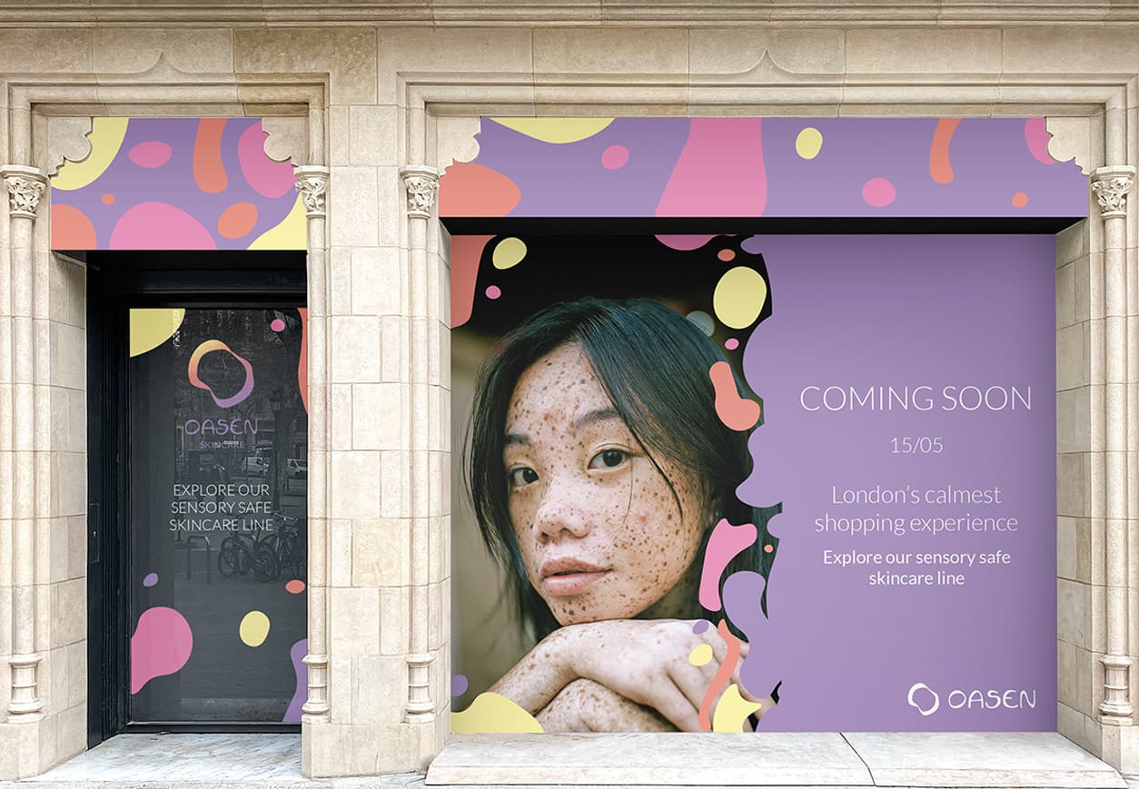
To empower people with sensory differences, we decided to create a sensory-safe skincare brand: Oasen. Launching a series of low-sensory pop-up stores in major cities, providing refuge from the hustle and bustle -- giving neurodivergents a safe space and a chance to connect with others that share the same issues.
Visual Strategy
Logo and Type:
Oasen is a spin on the word 'Oasis', as we wanted our brand to be a sanctuary. Bringing this insight through the visual identity of the brand, the logo is in the shape of an oasis.
I hand-lettered 'Oasen' as we wanted it to have a soft and hand-made look, and chose a simple secondary typeface - Lato - to compliment the lettering and create a clean look.
Colour:
Our research into neurodiversity and colour informed our colour palette choices, avoiding bright and overstimulating colours, opting for a soft sunset-inspired colour palette.
Illustration:
The blob illustrations were inspired by lava lamps - a visual stim tool for neurodiverse individuals - to create a soft and soothing, yet visually exciting design.


Brand Strategy
Products:
- Sensory-safe with non-greasy textures and fragrance-free.
- Have fidget aspects built into the packaging, like the fidget ring on the neck of the cleanser bottle.
- Use fully recycled packaging and reef-safe filters in our sunscreen to reduce environmental impact.
Imagery and Tone:
Using non-retouched imagery throughout every brand touchpoint is essential to our brand, as we want to celebrate a variety of skin types and textures to help young people feel affirmed.
Additionally we wanted to have a positive brand tone, avoiding language like 'anti-blemish', and including positive affirmations on our packaging to encourage positive self talk.
Pop-up and Experience:
We decided that a pop-up store was a trendy way to offer a safe space to nurture a neurodiverse community, and fully accommodate to sensory differences.
The pop-up store experience would:
- Be low-sensory by using natural or warm lighting (no harsh lights), limited in-store capacity, fragrance-free environment, no music, and offer disposable earplugs, and having a seating area with stim toys.
- Offer testers for customers to trial the products.
- Have a conversation area to nurture community.
- Opportunity to purchase full-size products.
- Positive affirmation stickers with a QR code to the Oasen Discord community.


Concept, Visual Identity, Research: Emily Willis and Julia Barbagallo.
Packaging: Julia Barbagallo.
Motion Design: Emily Willis.